Data Analysis Using Python > Correlation > What is correlation?
What is correlation?
The purpose is finding the relationship between two quantitative variables without being able to infer causal relationships. Correlation is a statistical technique used to determine the degree to which two variables are related. Correlation between two variables can be observed by construction scatter diagram of them.
What is Scatter diagram?
It is a graphical representation used to display the relationship between two variables. It shows how much one variable is affected by another, making it a key tool in correlation analysis. The following properties are in a Scatter diagram:
- Rectangular coordinate
- Two quantitative variables
- One variable is called independent (X) and the second is called dependent (Y)
- Points are not joined
- No frequency table
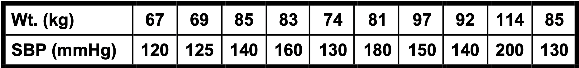
In the follwing, we have a data set for weight and blood pressure of some patients. Is there any relation between them ? i.e. correlation between them? Let us draw a sctterplot:
Example of constructing Scatterplot : Python Codes:
wt = [67, 69, 85, 83, 74, 81, 97, 92, 114, 85]
sbp = [120, 125, 140, 160, 130, 180, 150, 140, 200, 130]
plt.figure(figsize=(8, 5))
plt.title("Scatter Diagram: Weight vs Systolic Blood Pressure")
plt.xlabel("Weight (kg)")
plt.ylabel("Systolic Blood Pressure (mmHg)")
plt.grid(True)
plt.scatter(wt, sbp, color='blue', edgecolors='black')
plt.show()
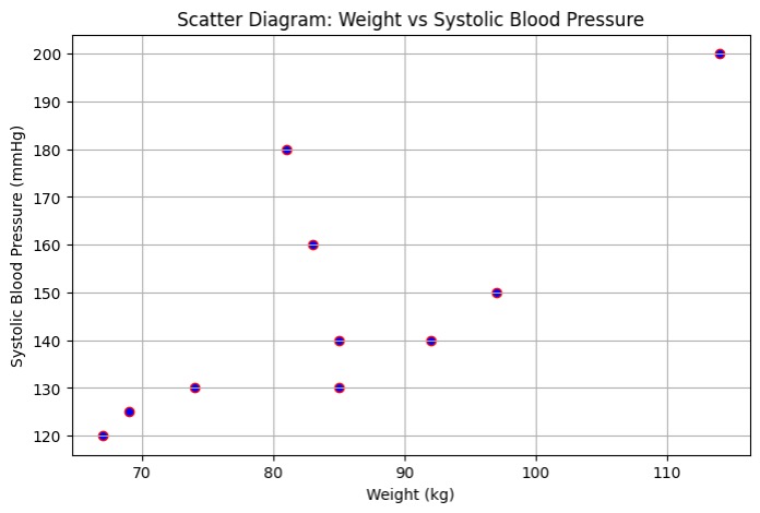
This scatter diagram shows that there may be a trend between weight and blood pressure.
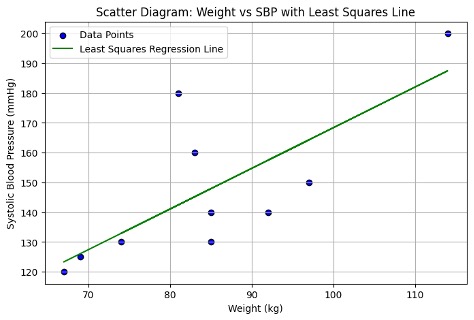
Also, we can believe that there is a relation. This relation is positive. When one increases another one is also increase. This type of relation is called correlation. Here in this particular situation it is positive correlation.
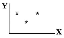
The pattern of data is indicative of the type of relationship between your two variables:
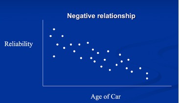
- positive relationship
- negative relationship
- no relationship
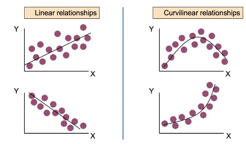
So relationship may be linear which may be either positive or negative. Relationship may also be curvilinear as follows:
No More
What is Correlation Coefficient?
Feedback
ABOUT
Statlearner
Statlearner STUDY
Statlearner