Data Analysis > Descriptive Statistics > Frequency table for a Continuous data
Frequency table for a Continuous data
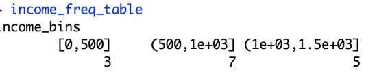
Now we will construct a frequency table income column.
- Select lower limit of class interval i.e. 0-500, 500-1000, 1000-1500, 1500+
breaks <- c(0, 500, 1000, 1500) # Income ranges
- Specify all the income data to the class interval. data[[5]] is the income column
income_bins <- cut(data[[5]], breaks, right = TRUE, include.lowest = TRUE)
- Construct Frequency table
income_freq_table <- table(income_bins)
print(income_freq_table)
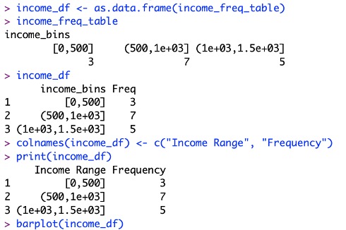
- To make frequency table to general dataFrame:
income_df <- as.data.frame(income_freq_table)
colnames(income_df) <- c("Income Range", "Frequency")
print(income_df)
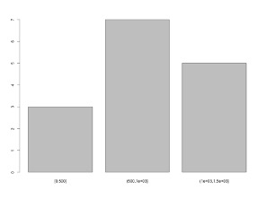
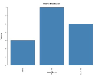
- For a better bar plot:
barplot(income_freq_table, main = "Income Distribution",
col = "steelblue", xlab = "Income Range",
ylab = "Frequency", las = 2)
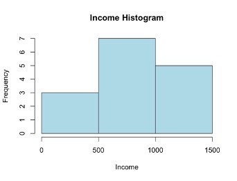
- Histogram: For histogram original data will be input and bins also.
hist(data[[5]], breaks = breaks, col = "lightblue",
main = "Income Histogram", xlab = "Income")
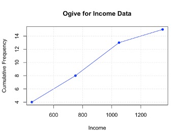
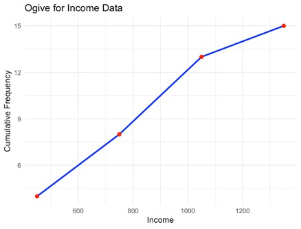
What is an Ogive?
An ogive is a cumulative frequency graph used to show the number of observations below a certain value. It helps to get the idea how data accumulates over a range.
How much observations are bellow 1000. The answer is 12.

Constructing Ogive for income data
- Load the package:
library(dplyr) # For data manipulation
- Load the data:
setwd("/Users/mdfazlulkarimpatwary/documents/Rtraining/")
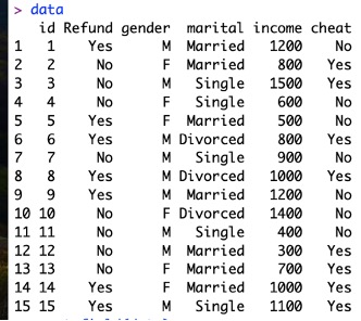
data=read.csv(“Cheat.csv”, header=TRUE)
- Above is a tibble (dataFrame), extract income data which is in column 5
income <- data[[5]] # Extract as numeric vector
- Define bin breaks
breaks <- seq(min(income, na.rm = TRUE),
max(income, na.rm = TRUE), by = 300)
Here na.rm = TRUE indicates to remove null values
- Categorize income into bins
income_bins <- cut(income, breaks = breaks,
include.lowest = TRUE, right = TRUE)
Here,
include.lowest = TRUE means lowest value is included in the first interval.
right = TRUE means intervals are right-closed ((a, b])
- Constructing frequency table:
freq_table <- table(income_bins)
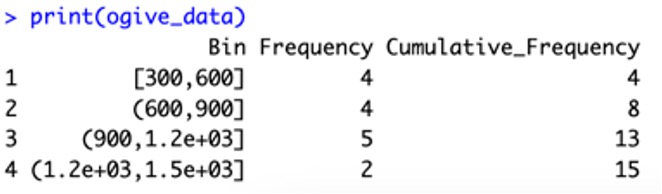
- Construction Cumulative frequency
cum_freq <- cumsum(freq_table)
- Convert Bin Range, Frequency and Cumulative Frequency to data frame with headings:
ogive_data <- data.frame( Bin = names(freq_table),
Frequency = as.numeric(freq_table),
Cumulative_Frequency = as.numeric(cum_freq))
print(ogive_data)
9. Convert bin labels to midpoints for plotting
bin_midpoints <- (head(breaks, -1) + tail(breaks, -1)) / 2
plot(bin_midpoints, cum_freq, type = "o", col = "blue", pch = 16,
xlab = "Income", ylab = "Cumulative Frequency",
main = "Ogive for Income Data")
# Add grid for better readability
grid()
We can use package ggplot2 also:
1. First install the package:
install.packages("ggplot2")
2. Prepare a datFrame for this using mid point of Bin Range and cumulative frequency
ogive_df <- data.frame(Bin = bin_midpoints,
Cumulative_Frequency = cum_freq)
3. Plot construction:
ggplot(ogive_df, aes(x = Bin, y = Cumulative_Frequency)) +
geom_line(color = "blue", size = 1) +
geom_point(color ="red", size = 2) +
labs(title = "Ogive for Income Data",
x = "Income", y = "Cumulative Frequency") +
theme_minimal()
Feedback
ABOUT
Statlearner
Statlearner STUDY
Statlearner