Data Analysis Using Python > Data Visualization > Counter Bar Plot
A classic Seaborn plot “count Barplot” often used in Exploratory Data Analysis (EDA).
Example:
import pandas as pd
import seaborn as sns
import matplotlib.pyplot as plt
data = {
'Survived': [0, 1, 1, 1, 0, 1, 1, 0, 1, 1],
'Sex': ['male', 'female', 'female', 'male', 'male',
'female', 'female', 'male', 'female', 'male']
}
data
Output:
{'Survived': [0, 1, 1, 1, 0, 1, 1, 0, 1, 1],
'Sex': ['male',
'female',
'female',
'male',
'male',
'female',
'female',
'male',
'female',
'male']}
df = pd.DataFrame(data)
|
Survived |
Sex |
|
|
0 |
0 |
male |
|
1 |
1 |
female |
|
2 |
1 |
female |
|
3 |
1 |
male |
|
4 |
0 |
male |
|
5 |
1 |
female |
|
6 |
1 |
female |
|
7 |
0 |
male |
|
8 |
1 |
female |
|
9 |
1 |
male |
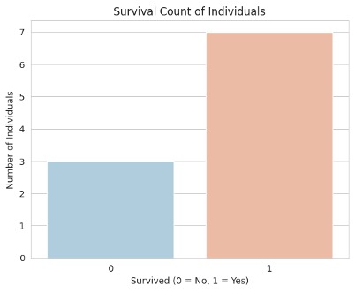
sns.set_style('whitegrid') # Set Seaborn style
# constructing countplot
sns.countplot(x='Survived', data=df, palette='RdBu_r')
# Add labels and title
plt.title('Survival Count of Individuals')
plt.xlabel('Survived (0 = No, 1 = Yes)')
plt.ylabel('Number of Individuals')
plt.show()
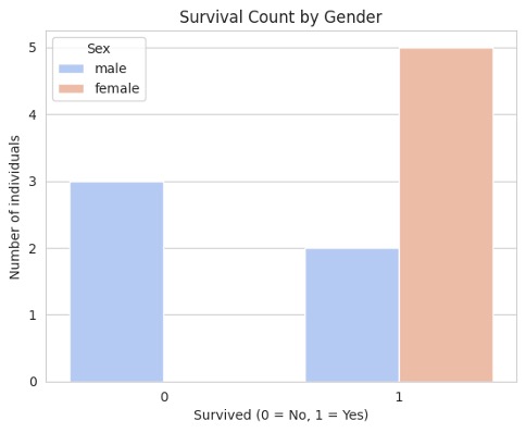
To see survival counts by gender:
sns.countplot(x='Survived', hue='Sex', data=df, palette='coolwarm')
plt.title('Survival Count by Gender')
plt.xlabel('Survived (0 = No, 1 = Yes)')
plt.ylabel('Number of individuals')
plt.show()
Feedback
ABOUT
Statlearner
Statlearner STUDY
Statlearner