Data Analysis Using Python > Data Visualization > HeatMap
HeatMap
A heatmap is a type of data visualization that shows how values vary across a matrix using colors instead of numbers. It uses colored grid where each cell’s color represents the value in that cell — darker or lighter colors often mean higher or lower values.
import seaborn as sns
sns.heatmap(df.isnull(), yticklabels=False, cbar=False, cmap='cividis')
Explanation:
- df- Dataframe consisting the data
- isnull() - Creates a Boolean DataFrame where each cell is:
- True → if the value is missing (NaN)
- False → if the value is present
- heatmap(...)- Plots a heatmap (colored grid) showing which cells are missing.
- Arguments :
- yticklabels=False → hides the row labels for clarity.
- cbar=False → removes the color bar from the side.
- cmap='cividis' → uses the “cividis” color palette for the heatmap (a visually accessible gradient).
Output:
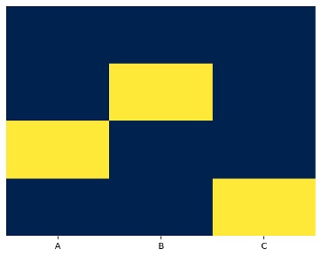
- Yellow cells or light color = missing values
- Dark cells = non-missing values
So, this chart quickly detect patterns of missing data
Example:
import pandas as pd
import seaborn as sns
import matplotlib.pyplot as plt
data = {'A':[1, 2, None, 4], 'B':[5, None, 7, 8], 'C':[9, 10, 11, None]}
data
Output:
{'A': [1, 2, None, 4], 'B': [5, None, 7, 8], 'C': [9, 10, 11, None]}
df = pd.DataFrame(data)
Output:
|
A |
B |
C |
|
|
0 |
1.0 |
5.0 |
9.0 |
|
1 |
2.0 |
NaN |
10.0 |
|
2 |
NaN |
7.0 |
11.0 |
|
3 |
4.0 |
8.0 |
NaN |
sns.heatmap(df.isnull(), yticklabels=False, cbar=False, cmap='cividis')
plt.show()
No More
Counter Bar Plot
Feedback
ABOUT
Statlearner
Statlearner STUDY
Statlearner