Data Analysis Using Python > Regression > Practical Example using Python
Exercise: A sample of 6 persons was selected the value of their age (x variable) and their weight is demonstrated in the following table. Find the regression equation and what is the predicted weight when age is 8.5 years.
|
Weight (y) |
Age (x) |
|
12 8 12 10 11 13 |
7 6 8 5 6 9 |
Calulations:
|
Weight (y) |
xy |
Y2 |
X2 |
|
|
7 |
12 |
84 |
144 |
49 |
|
6 |
8 |
48 |
64 |
36 |
|
8 |
12 |
96 |
144 |
64 |
|
5 |
10 |
50 |
100 |
25 |
|
6 |
11 |
66 |
121 |
36 |
|
9 |
13 |
117 |
169 |
81 |
|
41 |
66 |
461 |
742 |
291 |
Now calculate Regression using the following example codes.
Python Codes
wt = [67, 69, 85, 83, 74, 81, 97, 92, 114, 85]
sbp = [120, 125, 140, 160, 130, 180, 150, 140, 200, 130]
-
wt: Independent variable (X) → represents people’s weights (in kg) -
sbp: Dependent variable (Y) → represents systolic blood pressure (in mmHg)
We are trying to see whether weight influences blood pressure.
The above is a list and we need to convert this lists to NumPy Arrays. .reshape(-1, 1) changes X from a 1D array to a 2D column vector
import numpy as np
X = np.array(wt).reshape(-1, 1) # to make x data into 2D structure
y = np.array(sbp)
To creates a scatter diagram, each point showing one person’s (weight, blood pressure) pair. This helps visualize the relationship.
plt.figure(figsize=(8, 5))
plt.title("Scatter Diagram: Weight vs Systolic Blood Pressure")
plt.xlabel("Weight (kg)")
plt.ylabel("Systolic Blood Pressure (mmHg)")
plt.grid(True)
plt.scatter(wt, sbp, color='blue', edgecolors='red')
plt.show()
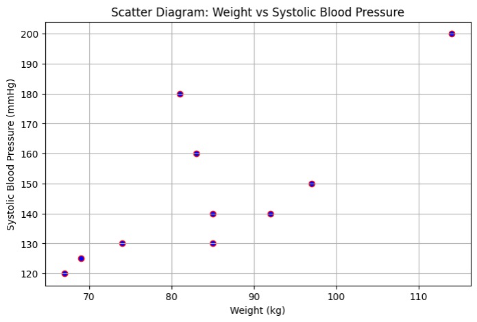
Graph notices that an upward trend: as weight increases, systolic blood pressure tends to rise.
Linear Regression:
First we need to import LinearRegression class from sklearn.linear_model. Then we need to create an object ourmodel, which represents our regression model.
from sklearn.linear_model import LinearRegression
ourmodel = LinearRegression()
ourmodel.fit(X, y)
Now we have the model "ourmodel" which is the representation of the relationship between weight and systolic BP.
-
Mathematically, it finds the best-fit line:
SBP=b0+b1×Weightwhere
-
→ intercept (value of SBP when weight = 0)
-
→ slope (how much SBP increases per kg of weight)
-
y_pred = ourmodel.predict(X)
Using the fitted model "ourmodel", y_pred is the predicted blood pressure for each weight in our dataset. These predicted points lie on the regression line.
plt.figure(figsize=(8, 5))
plt.scatter(wt, sbp, color='blue', edgecolors='black', label='Data Points')
plt.plot(wt, y_pred, color='green', label='Least Squares Regression Line')
plt.title("Scatter Diagram: Weight vs SBP with Least Squares Line")
plt.xlabel("Weight (kg)")
plt.ylabel("Systolic Blood Pressure (mmHg)")
plt.grid(True)
plt.legend()
plt.show()
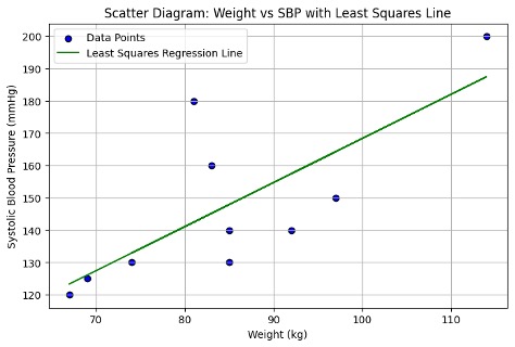 The blue dots show the actual data points. The green line shows our model’s predicted relationship which is the least squares regression line.
Comments: The fit shows the general trend: as weight increases, blood pressure tends to rise.
Feedback
ABOUT
Statlearner
Statlearner STUDY
Statlearner